


Ok, confession time. I chose the wrong white to paint the interior of my house. Yes you read it correctly, I chose a very wrong white and my poor husband had to paint the whole interior of the house again. That’s four coats the walls have had in the last couple of days. I felt really terrible about it but he said “it was ok, we all make mistakes” ( husband of the year I think!).
So here’s how the story goes…
The colour the walls were was Chalk USA ( Dulux ) as shown above. This warm white was a little bit to yellow for me and I wanted to brighten up the place a bit. The back half of the house faces south and the front north. The colour I chose incorrectly was White on White (Dulux). White On White is a cool white with grey/blue base tones. I really thought it would be OK. As the south facing room got painted it looked fantastic, but in the morning, the north facing room looked blue. Like a powder/baby blue, it was terrible.
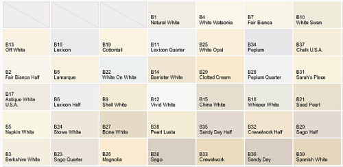
Here is a chart from Dulux showing the variance on the colour white. As you can see some of the whites are warmer like Chalk USA, Magnolia, and some of the whites are cooler, like White On White and Peplum. Light plays a huge factor into how the white will appear and feel in your home.
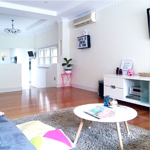
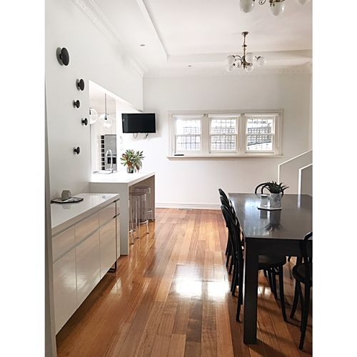
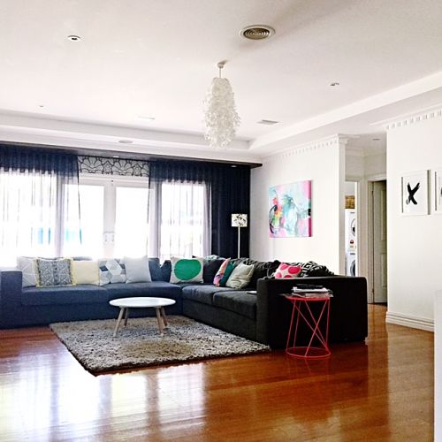
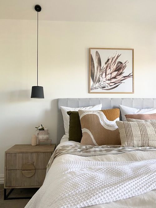
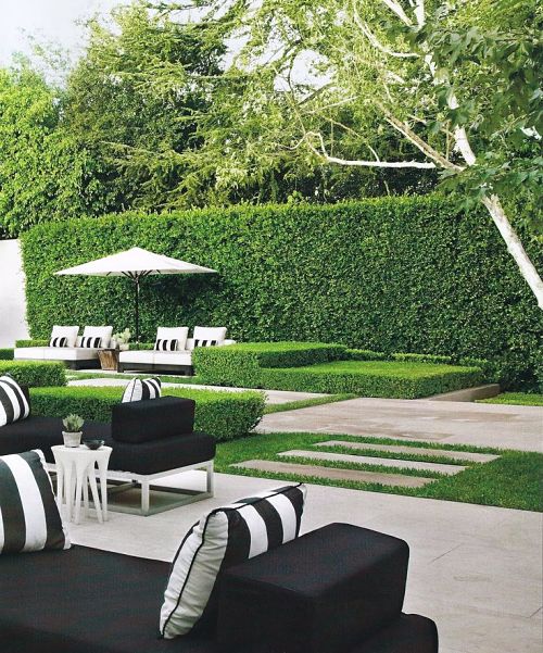
So you are probably wondering what white I went with? Well, after several sample pots later I chose Natural White also by Dulux. It is the brightest white in the warm whites. I am so pleased with the way it turned out. As seen above ( excuse lazy teenagers on the couch) it is a bright white with the tiniest amount of warmth in it. Perfect for my place.
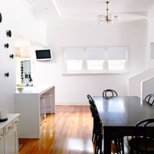
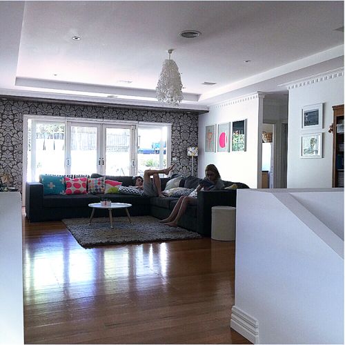
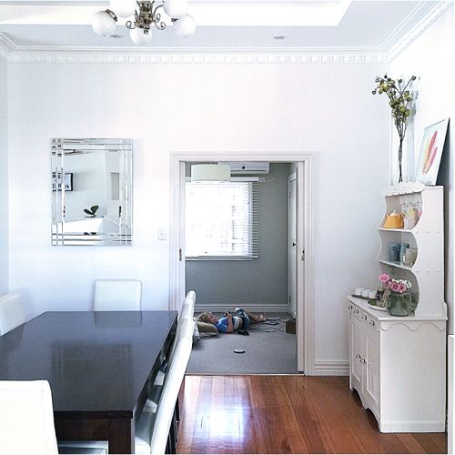
Here is another picture of my dining room looking into the study/toy room before I had my new chairs.
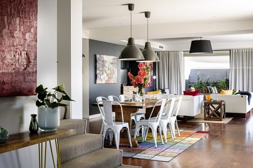
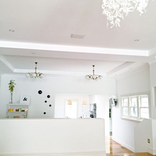
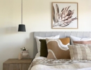
This picture courtesy of House Nerd shows how warm Natural White can be and how it can look completely different in other peoples homes.

So I thought I would give some tips to help prevent you guys making the same mistake as me.
My three tips for choosing the right white are:
1. Get Sample Pots, and lots of them.
2. Paint in different parts of your house, north facing, south, east and west facing.
3. View the samples in the morning, mid afternoon and evening before you make your decision.
I know now I should have grabbed a White On White sample pot but at least I know in the future to use them. White can be one of the trickiest colours to get right.
Have you had a painting disaster lately?


I chose vivid white for my interior walls, it was a good choice for our house. Who would have thought there was so many options of white?!! A test pot is always the way to go, otherwise it can turn into an expensive exercise. The other thing I learnt is that when getting a custom colour created always over order, I learnt the hard way with that!! 🙂
Hi Ashlea
Whites are hard to get right aren’t they? I guess we all learn the hard way.
Xo
We used whisper white throughout our home and I still love it although it could use a refresh, I decided to put a hint of grey in our main bedroom I chose the colour from a card that had a room all made up and the accent colours in the furniture etc were much like mine, dark greys, blues whites with pops of brights so I thought perfect but after hubby painted the room it was horrible purple 🙁 didn’t reflect blues at all the entire room is a shade of purple perfect if you are three but not the look I was going for, I have to wait now to buy more paint and hubby to have time to repaint it 🙁 3 months on we are still in the purple room 🙁 so annoying. Xx
Hi Tracy
It’s so funny how we all like to change things up a bit but then they go terribly wrong. I hope you get to paint you room soon to get rid of the horrible purple.
Yvette
x
I’m in the process of choosing a white for our walls (shhh, dear husband doesn’t yet know that I’m planning on changing our peach walls with mint trim (who thought that was a good idea??) to white). I’d been keen to just take a punt on Dulux Antique White USA, but will now definitely trial first with sample pots.
Our house faces north/north-west in the southern hemisphere, so its fairly warm with lots of natural light. I think a cool white is called for (any thoughts?). I absolutely cannot wait to have white walls, and maybe one day, a white kitchen!
You’d think I’d have learned by now – I had a mini breakdown when painting our backyard fence a dark-blue-grey colour. In the process of drying, the colour looked pale blue, not at all what I’d been hoping for. If I’d just done a test patch (and waited for it to dry) I could have avoided a whole lot of stress! When it dried, it looked perfect.
Hi Jo
I love the Antique White USA also but thought it was a bit too warm for my place. I originally painted Chalk USA. I loved the Natural White as it was the brightest of the the warm whites. Best just to do a few sample pot tests I think. I think that I was just a bit to impatient.
Yvette
x
What timing for your article!
The story on reverse.
7 months ago bought our first home .
3 months ago decided I couldn’t stand the pink/salmon textured wall paper in the living area any longer so pulled it down.
3 months of being weekend Diy warriors.
8 same pots of various Dulux whites, samples all over the walls in different locations.
(Confused as to why Beige Royal is closer to grey and nothing like paint swatch??)
Confidently chose Stowe White…..
Now hate it! It’s so yellow! It didn’t look at all yellow on my sample brush ons! AND, the touch of green in it is magnified by the green grass in the backyard.
Now I’m not sure what to do? If you can’t get a good indication from a 1x1m2 brush on how do you decide?!
Berkshire white is the wall colour throughout the main part of our house, I am still working my way through painting to cover the yellow from the 90’s ! Big job on a double storey house. plus working full time and 3 boys .
Hi Shauna, Berkshire white sounds perfect, as long as you have sampled it before, oh boy did I learn my lesson.
Yvette
x
Hi, I can relate to your story. I painted my daughter’s room lexicon quarter as it looked great on my a4 painted board. Terrible mistake the whole room looks pale blue and cold. Now looking at repainting in natural white. Do you find it has a pink tinge at all? Lisa
Hi Lisa
Yes, it was a huge mistake that I made with choosing the right white. A lesson learnt. The Natural White is perfect in my house with no pink tinge at all. My advice would be to definetely get a few sample pots so if you don’t like it, you re not repainting the whole house.
Thanks for stopping by.
Yvette
x
Lisa, I’ve used Natural White in the wet areas of my apartment and it does definitely put out a pink tinge in certain areas.
I’ve switched to Snowy Mountains Quarter for my living room and its a bit too white so I’m going to give White Polar Quarter a try.
Hi Ben, I am thinking of painting our house in Snowy Mountains Quarter. I know you have mentioned that it is very white (I am fine with that) – does it throw a colour at all? Blue? Green? Grey? I am concerned of it being too ‘cool’…. Many Thanks, Brooke
Hi Ben and Yvette
Note that you rejected Snowy Mountain Quarter as being too white, Ben. Could you tell whether it was throwing to grey or blue? We’ve just had a disaster of a paint where the painter ‘matched’ kitchen cabinetry but our request to avoid a blue or grey cast was overlooked and we have a passage that looks like an iceberg it’s so blue! We are considering Vivid White or SMQ – we are building a small, open plan, modern house; gal and timber, polished concrete floors, charcoal/navy carpet, timber highlights, white kitchen, white and grey bathroom, huge north-facing windows (sun doesn’t hit walls in main kitchen/living area).
All thoughts welcomed!
Hi Yvette. Just wondering what colour you used for your trims? They look great against the Natural White… Belinda
Hi Belinda
Thanks so much for stopping by. The colour of my trims is a very old old colour called New York by Dulux. You can ask your paint supplier to mix it up for you. It does work well against the Natural White but it is always best to get a sample pot just to be sure.
Thanks Yvette
x
Hi Yvette, Oh how I’m struggling with which white to use in a light filled living area with high ceilings 🙂 I’ll have a look at all suggested. Was wondering what colour you used on your Ceiling? That’s a huge concern for me presently. Tanya
Hi Tanya
Thanks so much for stopping by and reading my post. The ceilings throughout my whole house are painted ceiling white which you can buy straight from the tin, no pre mixing required. Hope that helps Yvette x
Hi Yvette,
I’m so happy to have found this article! We’re currently renovating our home, and have gone with natural white (with some wood) for the kitchen. We were advised to carry the natural white through on the walls in the open plan living dining room, and the rest of the house, which we are going to do. Our problem is carpet and and window furnishings for the bedrooms. I’d lie to go grey tones, however have been told this will make the natural white look more cream/yellow. It looks like you’ve used grey in your house, how do you fine it with the natural white paint?
Many thanks,
Michelle
Hi Michelle
thanks so much for stopping by. Yes I know exactly what you mean about the Natural White looking a little yellow however my house at the back where faces south so doesn’t get very strong natural light. I have used for the trims and arcs and the doors a very old colour called New york by Dulux and it is a little grey based. I guess it just depends on where the light falls. I have had no problem with these colours together in my house.
Good luck.
Yvette
x
Hi Yvette. Thanks for the great article. I’d love to hear your thoughts – I am building a small 2 storey, north-facing townhouse in Perth. The upstairs open plan living/dining/kitchen area gets lots of natural light with a wall of bi-fold doors leading out to a north facing concrete-look tiled terrace with a Vergola roof (to allow more light) and high-line windows above the roof line. There are black window and exterior door frames, with an all white kitchen with frosted oak flooring throughout. The downstairs area has limited natural light so I have no idea which white might tick the boxes for both levels as I need to use the same paint throughout. The colours that seem to go best with my kitchen cabinetry, stone bench tops and flooring seem to be Vivid White, Lexicon Half and Natural White but I am totally confused as to how to pick the right white for areas with different amounts of natural light. As I said – I’d love to hear your thoughts! 🙂
Hi Rebecca
Great to hear from you. Your building sounds amazing and I wish you every success with it all, it’s very exciting. White is a very hard colour to choose as I found out. It sounds like you have enough light to get away with a cool white but you just don’t want it to end up looking blue. I do love Natural White. I found that it worked well in my lighter rooms as well as my south facing rooms. I think the best thing to do is to get a few sample pots. Try to paint a whole wall in the colour you wish to go with. This may mean getting about 3 sample pots of the same colour. Start with the colour white you think will best suit. Let it try and test it in different light, morning, midday and night and even wait a few days before making your decision. White can be so tricky but I am sure you will get it right. Good luck with it all.
Yvette
x
We did our whole north/soth facing double storey California bungalow I interior natural white. Love it. I especially love depending on the light how the hallway can look slightly different to thr rooms etc.
My problem is that I think it makes our bedroom look a little sterile. I’m looking for a grey or very subtle colour to do as a feature wall behind our bed. Unfortunately we tried a aubigene/brown and it totally dictates what linen we can have (lucky I have a patient husand too)
We have a large main bedroom with 1 north facing wall of lead light windows. Any suggestions for a feature colour for bed?
Regards
Denise
Hi Denise
Your house sounds lovely. Thanks so much for contacting me. We have a north facing bedroom and I used Chalk USA, it has a bit of yellow in it but with lots of light being bounced around our room it creates a really lovely warm hue. Try a sample pot. Good luck with your renovations.
Yvette
x
Hi there!
What white paint would work best in north and south facing rooms – the tile (sold as Taupe) I’ve chosen is unfortunately throwing pink undertones which I’d desperatley like to eliminate. Was hoping to have crisp white coloured walls.
Many thanks
Hi Lou
Thanks so much for your question. White is such a difficult colour to get right and firstly I would say to get some sample pots. For a North facing room you can use a cool white. A white that has blue undertones would work well. For a south facing room I would choose a warm white with yellow undertones. I guess you really need to just get lost of sample pots until you find the right colour. Good luck!.Yvette xo
Hi Lou, I am really keen to know what you chose and how it worked for you. We are building a contemporary double story home and using a floor tile called La Roche which is a large concrete looking Italian tile with slightly pink udertones. I thought of using Vivid White throughout internally but it seems too stark against the tile. Now thinking of Polar white quarter but I do want to avoid ANY pink or blue undertones. Keen to hear Yvette’s input as well.
Please help.
Thanx
lin
p.s. We have decided on Vivid White for the outside – any comments good people ??? All input is welcome. There is a big tree out front so a lot of shade, with matt black window and door frames and black aluminium battons along the garage door , curving round to the entry gate.
[…] Start with a neutral backdrop (white or light grey walls and even white floorboards if you dare!). These tips to choosing the right white by Yvette from The Stylist Splash should point you in the right […]
We moved into our new home 4 months ago. The doors and skirtings are painted lexicon quarter. I am intrigued that many state that it has a blue undertone, as over this time our doors have turned a yellow colour. Can anyone explain this please?
Hi Angela
Best to contact Dulux on this one and maybe they can explain why it has turned a yellow colour.
Good luck
Yvette
I’ll hazard a guess as to why your doors have turned yellow… it’s been painted with oil based enamel.
Oil based gloss paint will always yellow – and worse in areas that get no direct sunlight.
Hi Yvette
I’m really glad I found your blog. I have a townhouse that faces mostly north east and south at the front. It gets a lot of natural light and sun. I am planning to paint throughout with Dulux Natural White enamel with a semi gloss on the doors and architraves. What colour would you suggest for the ceilings? I was thinking … quarter Lexicon.
Thanks
Marnnie
Hi Marnie
thanks so much for your lovely comments. I hope that the colour Natural White works out for you, we are very happy with it. I painted my ceilings just ‘ceiling white’ as I like a crisp clean white for the ceilings. Good luck with your painting and thanks for stopping by.
Yvette
x
Hi, We are in the throws of choosing an external white for our north/ northwest (southern hemisphere) home but are having a great deal of difficulty. We have a split level home with traditional red brick on the lower half and weatherboards on the top half and are elevated so are in the tree tops – throwing green onto the weatherboards (also has Ironstone roof). We chose Wattyl Powder white in Dulux paint and it looks either a horrible muddy purple or a worse green in others (I suspect from the trees). We had wanted a very neutral white so we weren’t clashing with or highlighting the red brick further but are now very lost with the addition of green from the trees. We tried about 20 greys but all went cold blue or muddy due to the contrast of the warmth of the brick. What would you recommend so that our house does not look purple, green, or dated yellow white against warm brick? Thank you.
Hi Amanda
Thanks so much for your comments. Without actually seeing your walls it is hard to recommend a paint colour. I would choose a colour that works well in the light you have. My house faces North but the back living room faces south and can be a bit dark. Dulux Natural White was neither too yellow or too blue it was just perfect for my home. I would advise lots of sample pots to get the right colour as every house is different.
Good luck
Yvette
x
p.s. I think we are now keen to look at a warm white due to the warmth of the brick making everything look cold. But are worried it will turn green or yellow. Eeeek!
Hi, I have no idea about colours. Wanted to brighten,. Went with recommendations. Vivid white ceiling & cornices, walls quarter polar. Woodwork half polar semi enamel gloss. Looks incredibly bright. Now being told a tinge of colour on walls would have been better??
What do you all think
Mandy
Hi Mandy
I think it’s a matter of opinion really. If you think your walls are too bright have you thought about introducing some art work to tone it down. There are so many places you can buy affordable art and that would save you having to repaint. Wall paper could be an option for you also. Good luck
Yvette
x
Hi Yvette and everyone,
Thanks for a great discussion and tips!
For those of you looking at Lexicon or Vivid White I can tell you that vivid white is pure white, no tint added, so you won’t ever see an undertone of another colour coming through. It’s a safe option if you want a white that is neither cool nor grey but it is very bright. Lexicon (and the half and quarter version) has just a dash of black in the white base, no other colours like red or yellow or blue added. This again means you shouldn’t see other undertones coming through when it is on it’s own although next to a warm colour, it will look cool (grey) in comparison. It’s amazing how much colours can change in appearance just by putting them next to other colours!
I have chosen Dulux Tranquil Retreat and Dulux Western Myall for different areas on the exterior of my house, and I’m trying (struggling!) to choose a white for the trims/eaves that compliments both colours. I think Vivid White is a bit too bright and had chosen Lexicon Half but I’m worried it too will look a little stark against the dark grey. However if I look at warmer whites against the Tranquil Retreat and Western Myall they look quite yellow or pink. Does anyone have any suggestions for a good white to match? I’ve already bought sample pots to try and am off to the paint shop to get a couple more today. Perhaps White Exchange Quarter or Snowy Mountains Quarter? Has anyone used these whites next to grey colours?
yes I am currently in one, I painted my house 4-5 yrs back and I’ve forgotten the name of the paint. now I’m looking at repainting and just giving it a fresh look. I have a beautiful white and it looks just like yours and I think it might be natural white. I will buy a sample pot next week and try it out. I think I’ve found the answer to what I’ve been looking for. thank you for sharing. your home looks great!
Hi Yvette,
I am in the middle of painting our house throughout with Antique White USA on the walls and Vivid White ceilings. My question is, do I need to paint the doors and trims with Vivid White (as a gloss) or do you think a softer white (like Natural White) would work in this situation? Just not sure if the vivid white would be too stark but I don’t want a really obvious difference between the ceiling and trim shades.
Thanks, Alex
Hi Alex
Sounds like you are having fun painting and I love Antique White USA it’s a great colour. In regards to your question we used a semi gloss as I didn’t want a high shine. Also we used the same colour that we used on the trims and arc as we did on the doors. I hope this helps.
Yvette
x
Hi Yvette
We have recently bought a federation-style two story brick home which has deep red carpet with lighter red swirls through it. We were going to rip the carpet up but it is very good quality so have decided to leave it. The house has stained timber trim and timber parquetry flooring in kitchen/family area. It is currently painted in Rich Cream and looks horrible. I have tried quite a few sample pots and am down to either Natural White or Antique White USA. Just not sure with high ceilings whether Natural White will be too white, or whether Antique White USA has too warm a tone? Standing back I like the contrast that Natural White has with the timber and carpet, but nor sure if this is in the right tone. Lastly the ceilings are painted in Lime White and are in good condition – can we leave the ceilings Lime White if the walls are Natural White or should the walls be a darker tone than the ceilings? The house has very wide cornices.
Hi Anita
Sounds like you’ve have bought yourself a gorgeous home, I do love a federation style house and I adore high ceilings. Without actually seeing your home it is hard to give advice on your colour choices. As I am not a colour consulant perhaps before you invest anymore money in paint it might be an idea to get one in. Dulux have a list on their website. In regards to your ceilings. I have painted my ceilings at my home Ceiling White. I like my ceilings to look crisp and clean, having said that Natural White is a warm white that goes with many colours but my advice would be not to mix it with cooler colours. If Lime White is a cooler colour then perhaps this might not match. I hope this advice has helped and enjoy your beautiful new home.
Yvette
x
Hi Yvette,
We are close to the end of our Reno and have all our kitchen cabinetry in Dulux Natural white.
I was thinking of painting all the internal walls in Natural white half strength as we get lots of
natural light in the back half of the house especially as it is east facing. Do you think this will be ok?
Also I was planning to do all the skirtings and trims in Vivid white. What are your thought son this?
I’m hoping that the 2 whites won’t clash…
Looking forward to your advice.
Wonderful blog btw – a great source of inspiration & knowledge, thank you!
Hi Lucy
Thanks so much for your lovely comments and how exciting that you are getting close to the end of your renovation. I have Natural White cabinetry also and have painted my walls in full strength Natural White. I do like a bright clean finish so therefore I didn’t do half strength. As I can only go on my own experience my best advice would be to grab a few sample pots of the half strength and see what you think. As for the skirting. As long as you stay in the right shades of white for your skirting then you should be fine. As Natural white is more of a warm white then choose from that end of the colour chart as a cool white might clash. Hope this information has helped and good luck with the rest of your renovation.
Yvette
x
Hi Lucy,
I rebuild my 3 storey home which I bought 1 year ago. Since my livjng is facing west it has too much light and warm. I wish to use cool light but there were too many whites and not sure which to choose. I do not like yellow base coz it will make it warmer. My floorings are wood color and earthy colors. I thought having used cream colors bring out the wood natural colors. But now I realised it has made my house warmer. Please help I need to cool down these areas.
Hi Yvette,
I’m so glad I found your blog, great tips and advice. You have a lovely home.
We have finally decided on a paint colour (our walls look like a patchwork quilt)…Natural White for walls,ceiling white for ceiling but are unsure as to the best trim colour.
I was thinking of going Natural White 1/4 or 1/2 in a semi-gloss Or maybe Vivid White but was worried about how Natural White would look against the Vivid White trim. Any advice would be greatly appreciated.
Cheers
Lisa
Hi Lisa
Sounds like you’ve done plenty of painting at your place. I guess when it comes to paint colour choice a lot of things factor into the decision based on light in the room, the height of the skirting and if they have a texture or pattern on them. My trims and arcs and skirting is all ‘New York’ a Dulux colour that has a bit of grey in it. I like it as it isn’t pure white. I guess the best thing to do would be to try some sample pots. A lot of people choose Antique white also. Good luck.
Hi Yvette,
We renovated our home about 14 years ago and chose Dulux half strength China White for all interior walls. As you can imagine our home is overdue for painting and so I decided to ring a Dulux paint store located in a ritzy suburb of Sydney – I thought the staff there would be experts in contemporary paint colours. I explained the position of our home and the previous paint colour chosen and the very helpful Dulux lady suggested Vivid White. I have painted my son’s north facing bedroom and our small south facing study and they both look so amazingly fresh and reflect the light at different times of the day beautifully. I’m leaving the rest of the painting up to professionals!
Thank you!
Alison
Thanks for stopping by Alison, yes good idea to leave it up to the experts. Sometimes it’s worth paying for their advice, maybe I should have as well.
Yvette
x
Hi Yvette,
Alison again – the very helpful Dulux lady suggested Natural White not Vivid White (I’m confusing you and my whites). So I have recently painted using Natural White as recommended and am very pleased!
Woops!
Alison
Dear Alison and Yvette what trim did you use. I have dozen so of little pots all over the house. With natural white.. what doors and trim? I have New York but it’s so ing up a mushroom colour. Vivid white doesn’t seem right… now what????
Thank you
Hi Yvette – the best part was that this was a free recommendation over the phone! Alison
Hi Yvette,
I’m so glad I found your blog, great tips and advice. thank u soo much for sharing.
Finally, We choose Natural White for walls,ceiling white for ceiling but thinking about the best color for trim and doors and also not sure which gloss finish should we choose semi-gloss or high gloss ?
Hi, thanks so much for stopping by. Natural White is a great colour to use on the wall and white for the ceiling is great. It’s best to get sample post for your trims and doors. I used an old Dulux colour called New York and went a semi gloss. I like the look of the semi gloss as I really think it is a personal preference. Good luck with the rest of your painting.
Yvette xo
Hi Yvette , thanks for your blog, its extremely helpful. We have painted our walls Dulux China White (full strength) and now thinking about repainting our door trims, architraves, skirts and doors. We are also installing oak flooring. Originally I was thinking about doing the trims in China White half strength but am now thinking I might need more of a contrast – what do you think of Whisper White, White on White or even Vivid White? Thanks for your help!
Hi Brenda
Thanks so much for your lovely feedback! When it comes to white it can be tricky. I am not familiar with China White but going a half strength in colour would be fine. If you wanted a bit more contrast then go for a different white. Just make sure that China White and Whisper White are the same either both warm white (with yellow undertones) or cool whites ( blue undertones). I guess sample pots are the way to go. Good luck
Yvette
x
Hi Yvette, we are almost at completion of build and painters start next week. We have chosed Vivid White throughout as I want a crisp fresh white. Our main bedroom and front living room are facing north and get lots of sunshine. I’m concerned the bedroom will be too white and was thinking of painting Snowy mountain (Dulux ) in our main bedroom. have you used this colour before. Any advice.
Hi Alyssia
Thanks so much for your enquiry, I am not familiar with Snowny Mountain by Dulux as I have not used this colour before. My best advice would be to buy sample pots and paint them on the walls. I have used Natural White and are happy with this colour.
Hope this helps
Yvette
x
Hi Yvette, thanks for your blog it’s very helpful. We are in the process of picking a white for our kitchen cabinetry. Our walls are in Dulux Natural White. Can you suggest a white that would compliment the Natural White? Much appreciated
Hi Suzie
Thanks so much for your enquiry, I have 2 pac kitchen cupboards in Natural White and I painted my walls in the same colour. I hope that helps.
Yvette
x
Which is a crisp, bright white to do our kitchen, like the white of the fridge to be a contrast with our modern cupboards,.
Hi Sue
Thanks for your enquiry. It’s best to go and grab lots of sample pots as depending on the lighting in your kitchen will depend how white the white looks. Just for your information, I actually have a stainless steel fridge but painted my kitchen in Natural White.
Thanks for your enquiry.
Yvette
x
Hi Yvette,
Trying to choose between Dulux White Exhange half and dulux natural white. Bedrooms get most direct sunlight. Floor tile is a very soft grey with some off white tones in it and kitchen is white gloss. Want an inviting white that isnt too white. Any thoughts?
Hi Nadia
Thank so much for stopping by. I am not familiar with Dulux White Exchange but I just love natural white. I found Natural White to be a little more yellow based so maybe go for lots of sample pots to see if it matches your floor tiles. Good luck xo
Hi Yvette
Love reading your blogs. Can you help me please? I am building a new home in the Adelaide hills. The building is a combination of a replica 1800c rendered cottage with adjoining modern glass filled fronted living area which is contrasting to the cottage in colourbond iron shale grey. I have chosen vivid white for the exterior fascias and verandah posts around cottage and modern addition. Cottage is a light coloured natural mud brick colour which also contrasts the shale grey colourbond with silver framed windows. I have chosen natural white dulux throughout for interior walls and ceiling white for ceilungs. We will have concrete polished floors in main living area and timber for rest of house. Can I use the natural white for skirtings and architraves and doors or do I need to contrast with another white? Cheers Kerry
Hi Kerry
Thanks so much for your comments. I love the Dulux colour Natural White and if you want a seamless finish then I would think it would be fine to use on the skirting and arcs. I have an older style home with floorboards so I wanted to use a different colour for the doors, arcs and skirting. I used an old colour called Dulux New York. I have heard Antique White is also a good option. I would suggest using lots of sample pots. Good luck xo
Yvette
Also Yvette
I’m not sure if choosing the natural white as a warm white is the right choice or if I should be choosing a cooler white. My eye seems to be drawn to warmer whites rather than cooler. I want to keep the same colour throughout whichever way I go.
Cheers Kerry
Hi Yvette,
I would love your advice on kitchen cabinetry colour please. Our walls are painted Antique White USA, the kitchen benchtop is Caesarstone Frosty Carrina and I was thinking we could do the cabinetry in Dulux Vivid White. Do you think that would work? Any advice would be very much appreciated. P.S. Love your wonderful website!
cheers
Rebecca
Hi Yvette,
My house is currently being painted White on White & I’m a bit concerned about the colouring. Do you remember how many coats it took to cover your wrong white? I’m not writing my white off just yet, but I’m curious about what I’ll be in for if I do decide I just cant have a White on White relationship.
Thanks so much,
Chelsea.
Hi there
Thank so much Chelsea for stopping by, from my own experience we repainted the walls with 2 coats. Good luck with your painting.
Yvette
x
Hi Yvette
Our 1915 bungalow is being painted in Dulux Natural White next week, with doors, skirts, fireplace surrounds, picture rails, window frames, etc, in Dulux Vivid White semi gloss. I can’t wait to see our custard yellow walls gone for good! Thank you so much for the advice and helpful tips you’ve shared.
Leanne
Hi Leanne
Thanks so much for stopping by, I am so glad that my tips were helpful to you. xo
Hi Yvette love reading all your tips. I have Beige Royal full strength on walls and am currently painting my very dark stained ceiling beams. I have gone for Whisper White but seems different to the sample pot and is looking cream. Maybe Natural White would be a better choice. I have used two coats of stain blocker as undercoat but not happy!
Any extra advice would be great cheers
Sue
Hi Sue
Thanks so much for stopping by, I found natural white to be a good colour as it didn’t look to blue in north facing areas and too cream in south facing areas, it was just right for my home. You could try sample pots (and lots of them). It really is a great white but it all depends on the light in your home. Nothing a sample pot won’t fix. Give it a try. Just so you know, I don’t really have any cream based colours in my home. My skirts and arcs area all grey based (cool whites) so natural white looked best with this. Good luck xo
Hi Yvette,
We are in reno mode and I’m second guessing my white. We purchased 5 different sample pots, used existing painted plaster that was ripped out and placed it around the house to see what it looked like. We’d settled on Hog Bristle Quarter. But after a random chat with a painter, he said in his opinion, it throws too much yellow in the light. He suggested going with an antique white/USA white and use it on the walls and ceilings. He suggested then going over the skirts/arcs in a different white if we didn’t like the look. I had not heard this before before so now I’m completely confused.
Hi Monica
Sounds like the painter threw a spanner in the works. I can only speak of my own experience and that is that I like to use a ceiling white for the ceiling and then I painted all my wall Natural White or in your case Antique White/USA. On the skirts/Arcs and doors I painted them a different white again. I used a very old Dulux colour called New York. So I use 3 different whites in one room, ceiling, walls and then one for arcs, skirts and doors. Hope that helps.
Yvette
x
My skirtings are lexicon quarter and I would really love Natual white but ive been told not to mix warm white with cool white.
We are building a house in Queensland which closely faces the ocean on the east side. The main room has very large windows facing east, so lots of light. The kitchen faces east as well but has a covered deck in front.
I like a white with no yellow or cream (warm) tones in it. I’m thinking that Lexicon or Vivid white is the way to go but my husband is concerned that they will be too bright in the sunny room.
If I use a half strength version of say, Lexicon, in what way does this affect the colour?
Any comments would be much appreciated
Hi Laura
Sounds like you are building a very nice house, how exciting for you. My advice to you would be to get sample pots. I am not at all familiar with Lexicon and half strength but think getting some samples and painting a large section of your wall will give you the answers.
Good luck with it all.
Yvette
x
Hi Yvette
Great article!
I’ve also decided to paint my house in Natural White. Do you think White on White half strength would work for the trims? It’s the colour that our painter has recommended but it has a cooler undertone so I’m not sure.
Any advice would be greatly appreciated!
Hi Lisa
I would definitely give it a try but use some sample pots first. Just go with your gut and see if you like it or not.
Yvette
x
I gave up years ago after a couple of disappointing colour schemes, now I use a colour consultant, it’s $150, but you get a discount voucher – $100 off Dulux paint). I’ve been delighted with the results. I know white is very tricky. we painted an investment unit recently, my husband complained about the 2 white colours that were selected, “white and white, we could have put that together?” Wrong!
The unit looks great – a very sophisticated look.
Hi Debra
I’m glad that you were happy with using a colour consultant, it’s well worth the money I agree. Considering you are going to spend time and money having to repaint if you get it wrong. Thanks so much for your comment.
Yvette
x
Just read all the comments . Thanks Yvette for your feedback.. Feeling happy .. only just decided today that our new kitchen cabinetry be painted 2pac natural white .
Now for the caesarstone..
So glad to hear Virginia. I love Natural White, good luck with your renovating.
Yvette x
Hi Virginia, i did the same (chose natural whute for my cabinets). What colour will you do on your walls? I chose Alpine white for caesar stone. Tricky decision! 🙂 Emma
Hi yvette, loved your article so i chose Natural white for our shaker kitchen cabinets. We have a bright room / house with timber floors. Alpine white caesar stone for kitchen bench. Should i do natural white on the walls too or should i contrast? We have cedar sliding doors (around 6 metres of glass & timber windows). What do you think?
Hi Emma
Your kitchen sounds lovely and I love choosing white to contrast against timber floors. The only advice I can give you is that I chose Natural White 2 pac for my kitchen cupboards and then painted the walls natural white also. I love the white look and found the that by painting the skirts/arc a different colour (mine are New York and old Dulux colour) that this broke up the whites. Good luck with you paining. Samples pots are a godsend.
Yvette
x
Yvette, are your skirting boards and architraves a different white? Or Natural White also? Love the look you’ve created!
Hi Candace
I used an old Dulux colour called ‘New York’ which is different to Natural White.
Hope that helps.
Yvette
x
We currently have antique white USA and find it a bit creamy dark in winter. Looking to repaint a bit lighter and tossing between white cloak quarter and natural white. Both with vivid white trim and Blackbutt floor. Will white cloak quarter be too similar to antique white USA and will natural white be way brighter ? Comfused and undecided. Help !
I am hoping to paint my whole house in shades of white paint and need some advice. The house faces north and receives plenty of sunlight and has a lounge room and 4 bedrooms facing north. While the bedrooms are fully carpeted the lounge and corridor leading to the bedrooms have polished timber flooring. The family/rumpus room is at the back of the house facing the south receives plenty of light as well and also has polished timber flooring. Which Dulux white paint would you recommend?. My painter suggested Lexicon Half White for the walls and Lexicon Quarter for the ceiling, doors and windows. But my wife is not very happy because it may give a grey or blue tone I guess depending on the amount of light it receives. What do you suggest?